
Data visualization is what you get when you mix data analysis with graphic design. It’s as much about interpretation as it is about presentation. Check our data visualization portfolio to see what we’ve put together.
With everything wired up or connected through the ether, collecting data is becoming easier every day. With the overwhelming amount of information we have, mining for the meaning behind the data is a bigger opportunity than ever. Big data has value only when the meaning can be communicated and the benefits conveyed. That’s the value of data visualization and infographics. Birch Studio converts complex spreadsheets, boring reports, and murky information into clear and compelling visuals to make your data sing.
Benefits
- Communicate information more clearly
- Hold your reader’s attention longer
- Inform and persuade decision makers
- Increase your brand’s mindshare
Features
- Versatile graphics that can be used in numerous formats
- Values explained in non-technical ways
- Clear messages that increase your potential user base
- Colors & styles integrated with your brand
- Unique to your organization’s goals
Process
The visualization of big data starts with an interview to understand your data, your target audience and your goals for broadcasting the information. We work with you to infer the meaning and then provide options on how to best present that information. We consider distribution methods (reports, website, PDFs, brochures) that will be used to reach your audience, then begin designing.
For a deeper dive, see our blog posts on data visualization.
How can we help with your Data Viz needs?
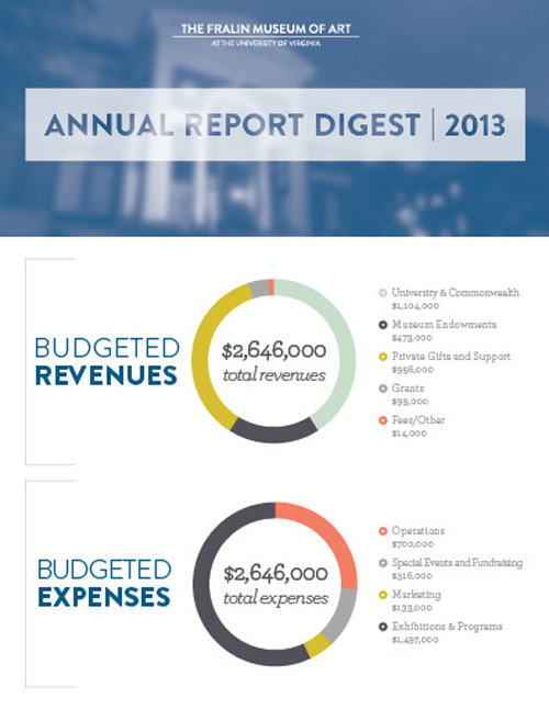
Simple Graph
This option can be any sort of graph or chart that has a number of data fields to compare. These are relatively straightforward and can be inserted into the widest variety of media (e.g. brochures, annual reports, websites, presentations).
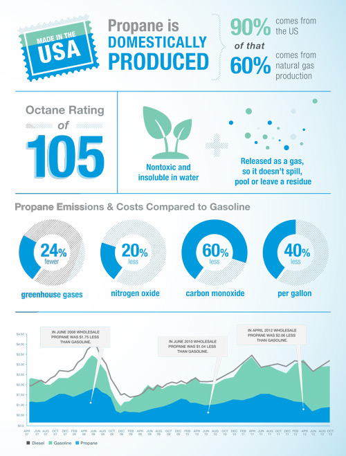
Multi-Graph Composition
The full page allows for complex data that tells a complete story. A variety of graphs, images and charts can be explored to illustrate a larger set of data. These are especially great for presentations, large brochures, product booklets, publications and websites with lots of space.
Animated Web Graphics
Animated data visualization is the souped-up sibling in the data visualization world that’s great for showing changes over time or just looking really spiffy. Using HTML5 and CSS3, we bring the graphics to life with color shifting, motion and interactive responses.
Video Motion Graphics
Data visualized as motion graphics can guide the viewer through complex data in stages, resulting in increased comprehension. These short video clips can be embedded in presentations, websites or even HTML emails.
Birch Studio: Fralin Data Visualization from David Robinson on Vimeo.
Get Started
