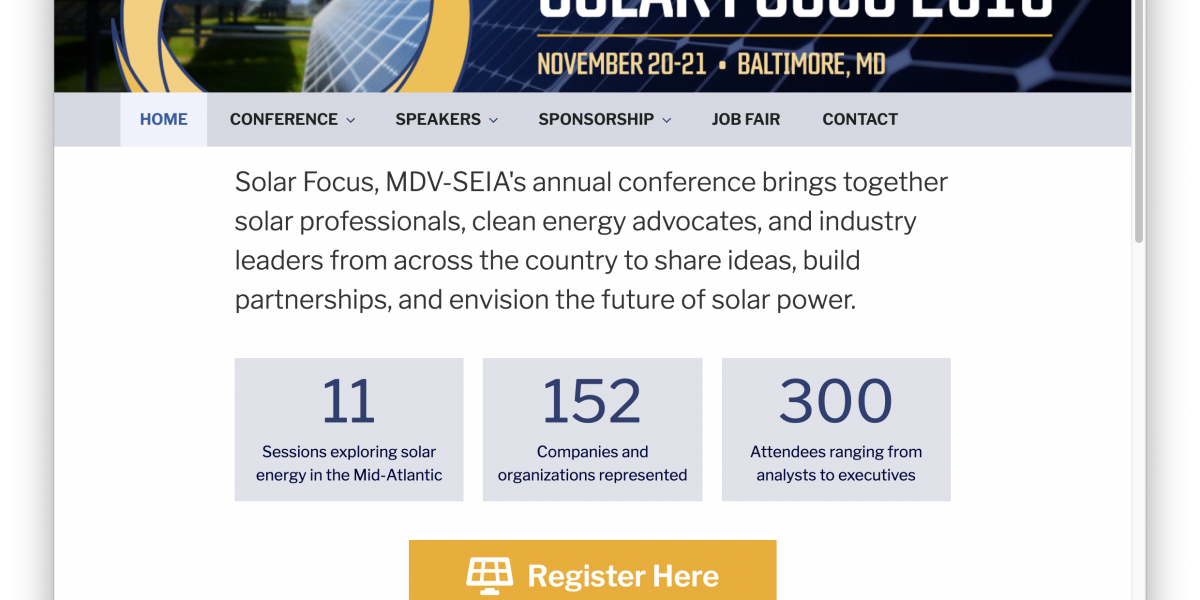
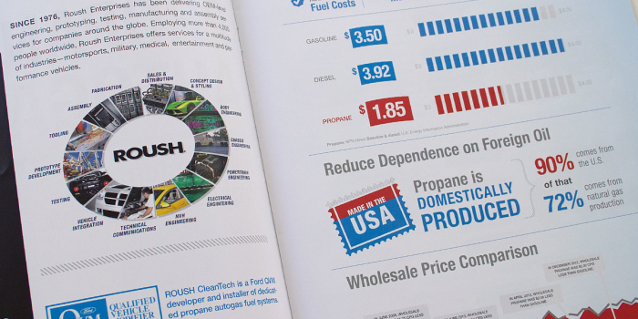
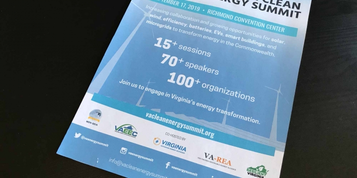
Birch provided a light facelift to this venerable conference website.
Work completed:
• Created a header using the circular logo previously developed.
• Added a photo of a solar array to help identify this instantly as in the solar industry.
• Added a shading effect to create a spotlight effect to create contrast with between the text and background image
• Removed the filter within the circular logo to cement its position in the composition and hint at a brighter future
• Enhanced counters by increasing size of numbers, adding background boxes
• Organized and renamed menus and pages for easier navigation
• More to come…


