Data Visualization
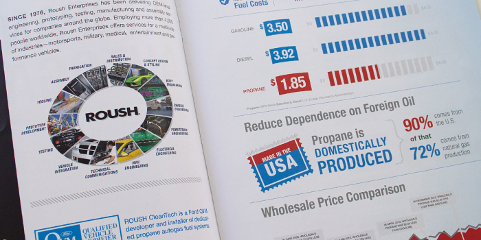
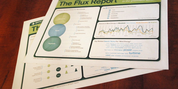
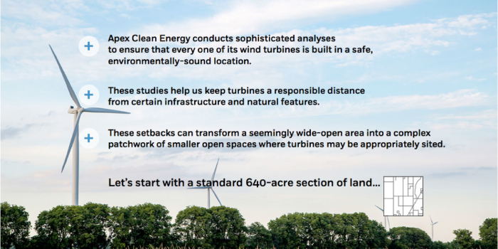
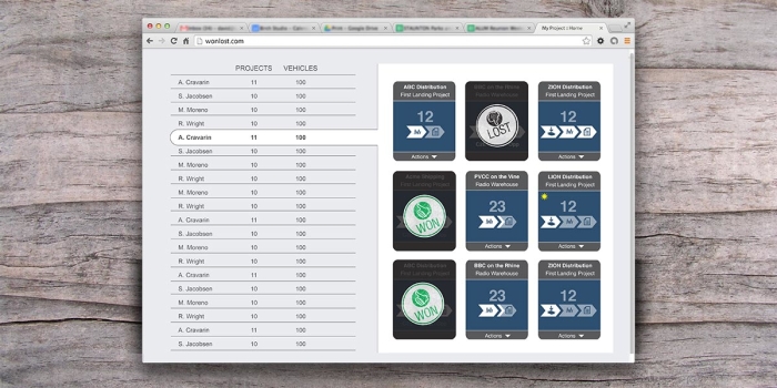
We specialize in data visualization for alternate fuels, clean energy and transportation. Examples in this category use the data visualizations in websites, presentations, annual reports, marketing materials, et cetera.
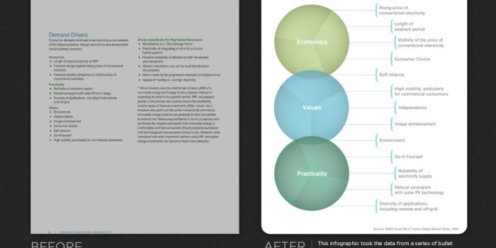
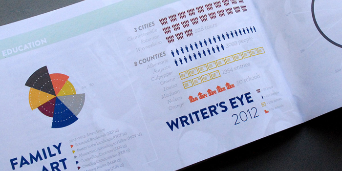
Data visualization is a visually-oriented way to present information. It allows the reader to see data in a way that doesn’t rely solely on numbers, such as you would see in a spread sheet or table. A variety of graphing styles are used, many of which are not available in Excel or off-the-shelf applications.
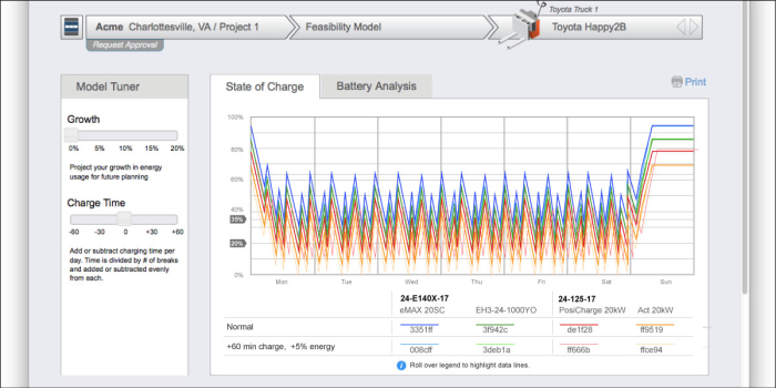
Data visualizations also tend to rely heavily on colors to distinguish one set of data from another. This allows both a greater level of understanding, and the opportunity for a more aesthetically interesting display.
Most people report that they are “visual learners” as opposed to those that want to read a spreadsheet. Data visualization is a perfect approach for those people as it fills their desire to view data visually. Data visualizations also tend to attract attention and increase legibility, and therefore, increase comprehension of the data being presented.
